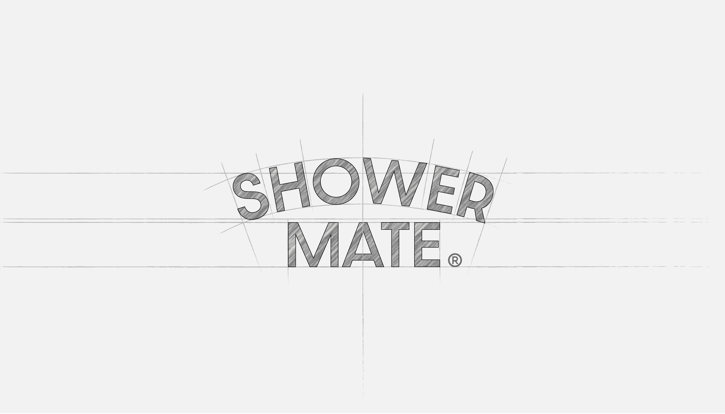
SHOWERMATE
Brand Identity Renew
Aekyung 2024
Brand Identity / Mood
Brand Logo
Brand Identity Guide
샤워메이트 브랜드 로고 리뉴얼은 브랜드 가치를 재점검하고 보다 명확한 브랜드 이미지를 확보하고자 새롭게 리뉴얼 되었습니다. 친근하고 즐거운 샤워케어를 연상시키는 브랜드 헤리티지를 계승하고자 ‘나를 위한 BODY Healing Mate’ 라는 브랜드 컨셉을 구축하고, 이를 바탕으로 보다 분명한 무드의 브랜드 이미지 시각화하고자 새롭게 디자인 되었습니다. 트렌드를 반영한 현대적이고 세련된 이미지로 리뉴얼된 샤워메이트 브랜드 아이덴티티는 글로벌 시장 진출과 함께 온,오프라인 채널을 보다 적극적으로 대응합니다.
The Shower Mate brand identity was reimagined to clarify the brand’s positioning and strengthen its visual presence. Inspired by the concept of “A BODY Healing Mate for Me,” the redesigned identity builds on the brand’s heritage of friendly and enjoyable shower care while introducing a more contemporary and cohesive visual language. The renewed identity balances warmth with modernity, creating a flexible system that responds consistently across global markets and diverse online and offline brand touch points.

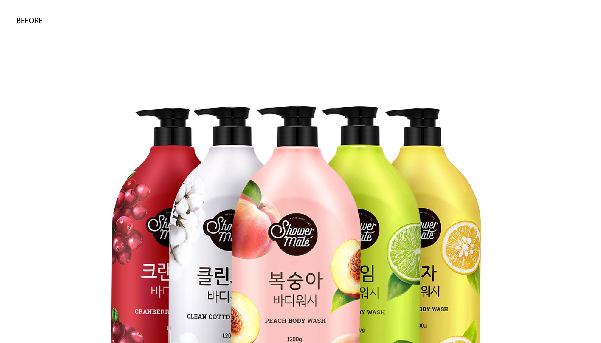
2017년 부터 사용해온 기존 로고는 불분명한 브랜드 메세지와 가독성이 떨어지는 점이 weak point 라고 할수 있었습니다. WEB 환경에 맞지 않는 서체. BI 와 워드마크의 이미지 불일치 등의 단점을 개선하고, 업그레이드된 브랜드 Value를 전달하는 것에 주안점을 두고 디자인 되었습니다.
The previous logo, which had been in use since 2017, presented several limitations, including an unclear brand message and reduced legibility. Its typography was not optimized for digital environments, and the visual inconsistency between the brand icon and wordmark weakened the overall brand identity. The redesign focused on addressing these issues while communicating the brand’s evolved values through a more cohesive and contemporary visual system.
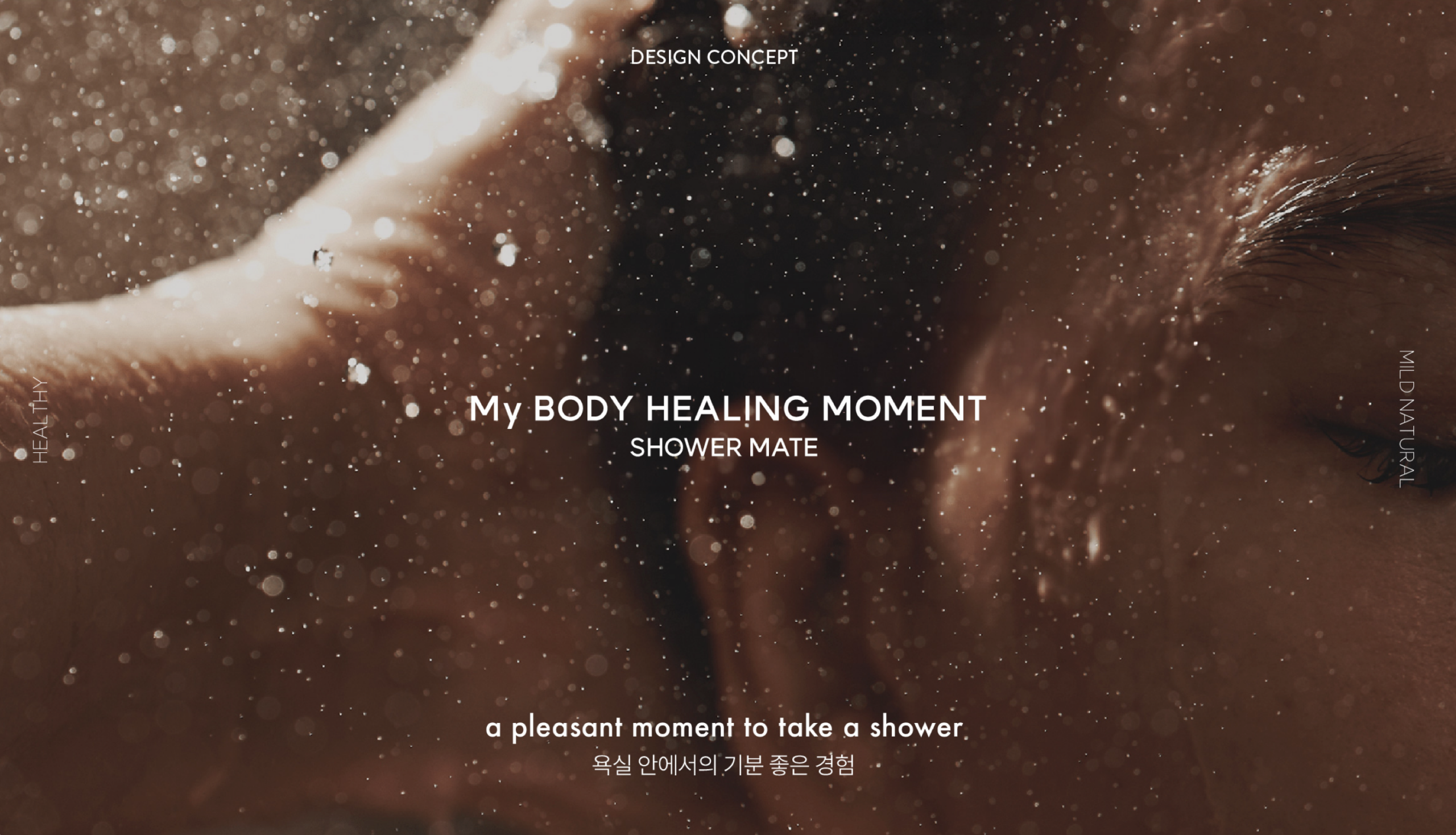
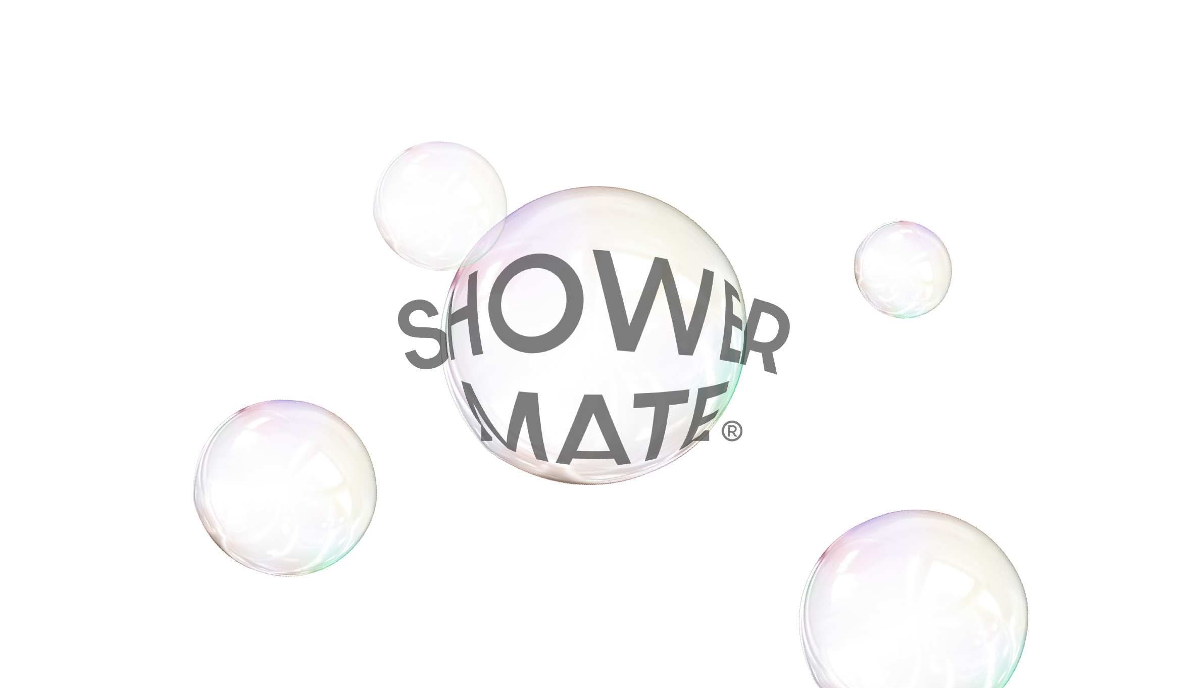
친근하고 건강한 마일드 네추럴 바디워시, ‘나를 위한 BODY Healing Mate’ 라는 브랜드 이미지를 반영하고자 BODY Healing Moment = 욕실 안에서 느끼는 기분좋은 순간, 긍정적인 감정을 은유적으로 디자인에 반영했습니다. 욕실안의 긍정적인 감정을 드러내는 다양한 디자인 아이디어와 로직을 스터디하였으며, 최종적으로 직관적이면서 인지하기 쉬운 아치형의 유연한 곡선의 라운드 쉐잎에 견고한 고딕 서체를 더한 디자인이 완성되었습니다. 아치형의 부드러운 곡선은 브랜드의 인상을 친근하게 드러내며 안정감을 부여하는 요소이며 브랜드 전반에 다양하게 활용됩니다.
To reflect Shower Mate’s brand image as a friendly, healthy, and mildly natural body wash, the design was inspired by the concept of “BODY Healing Moment”—the pleasant, uplifting moments experienced in the bathroom. This positive emotional experience was translated into the visual identity through a metaphorical design approach. A wide range of design ideas and visual approaches were explored to capture the positive emotions associated with the bathroom experience. The final identity combines an intuitive and easily recognizable arch-shaped, rounded form with a solid sans-serif typeface. The soft, curved arch conveys a friendly and approachable brand personality while providing a sense of stability. This signature shape serves as a core visual element and is applied consistently across the brand identity system.
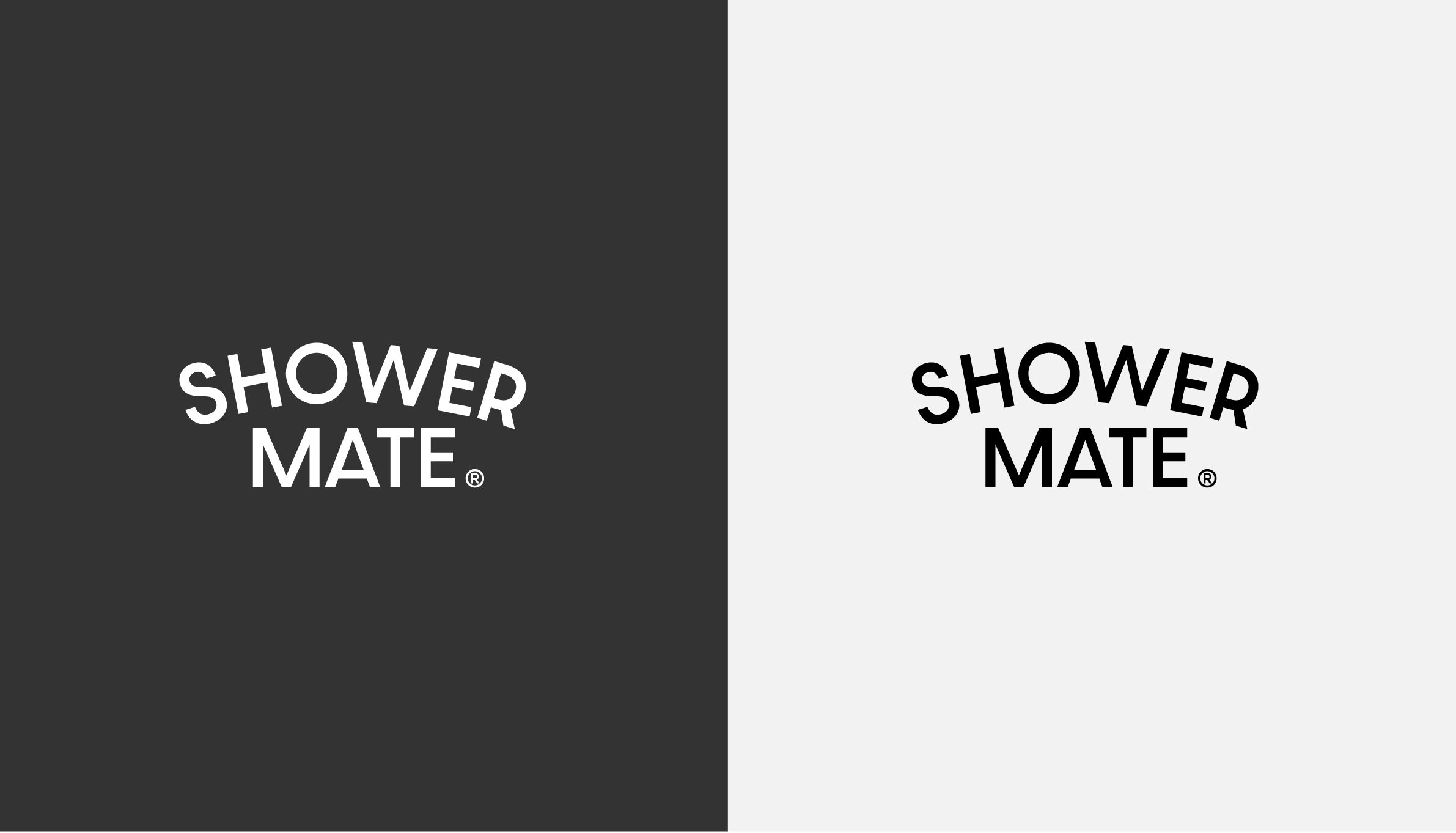
브랜드 아이덴티티는 로고, 심볼, 워드마크 타입을 모두 사용할 수 있습니다. 이미지적 요소가 다양하게 반영되는 바디케어 카테고리에 유연하게 활용하며 다양한 그래픽 언어를 표현할 수 있도록 설계되었습니다. 직관적인 오발형태의 라운드 쉐잎이 적용된 심볼 타입과, 워드마크 타입으로도 아이덴티티를 보여줄 수 있습니다.
The brand identity can be expressed through a logo, symbol, or wordmark. It has been designed to provide flexibility across the body care category, where a wide range of visual elements are incorporated, while supporting the expression of diverse graphic languages. The symbol features an intuitive oval-shaped rounded form, and the brand identity can also be effectively communicated through the wordmark.
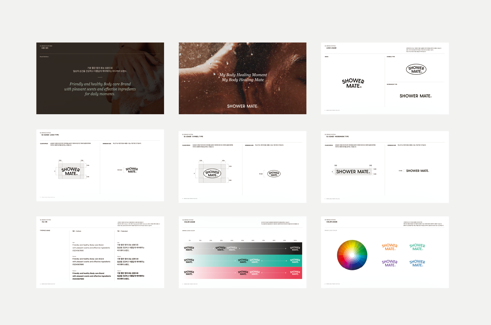

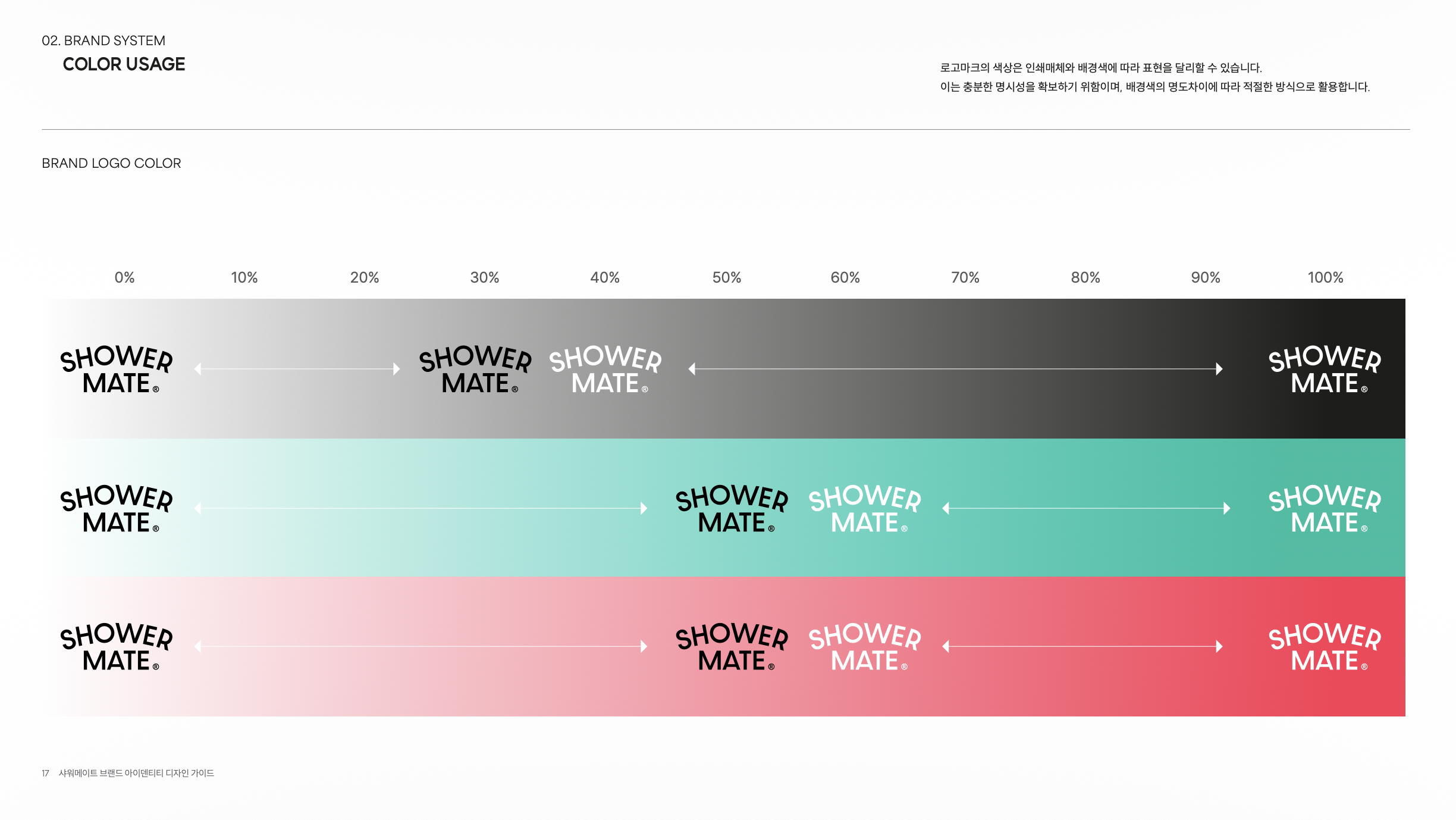
새롭게 디자인된 브랜드 아이덴티티의 브랜드 가치의 계승과, 일관성있고 체계적인 운영을 위해 브랜드 가이드북을 제작하였습니다.
This brand guideline has been created to ensure the consistent and systematic implementation of the newly redesigned brand identity while carrying forward its core brand values.

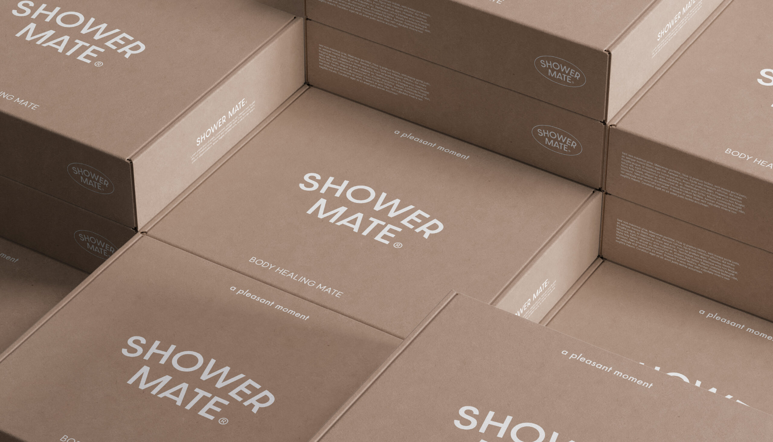

리뉴얼된 샤워메이트 브랜드 아이덴티티는 브랜드 가치를 명확히 하였으며, 친근하고 즐거운 샤워케어를 연상시키는 브랜드 헤리티지를 계승하였습니다.
The renewed Shower Mate brand identity clearly articulates the brand’s core values while carrying forward its heritage of providing a friendly, enjoyable shower care experience.
Project Manager : Hyunjin Koo
Project Lead Designer : Hyeryeong Yang
Design & Development : Kyunghee Bae, Hyeryeong Yang
BI Guide Book : Hyeryeong Yang