KERASYS
ADVANCED KERATIN BOND
Aekyung 2024
Package design
CMF
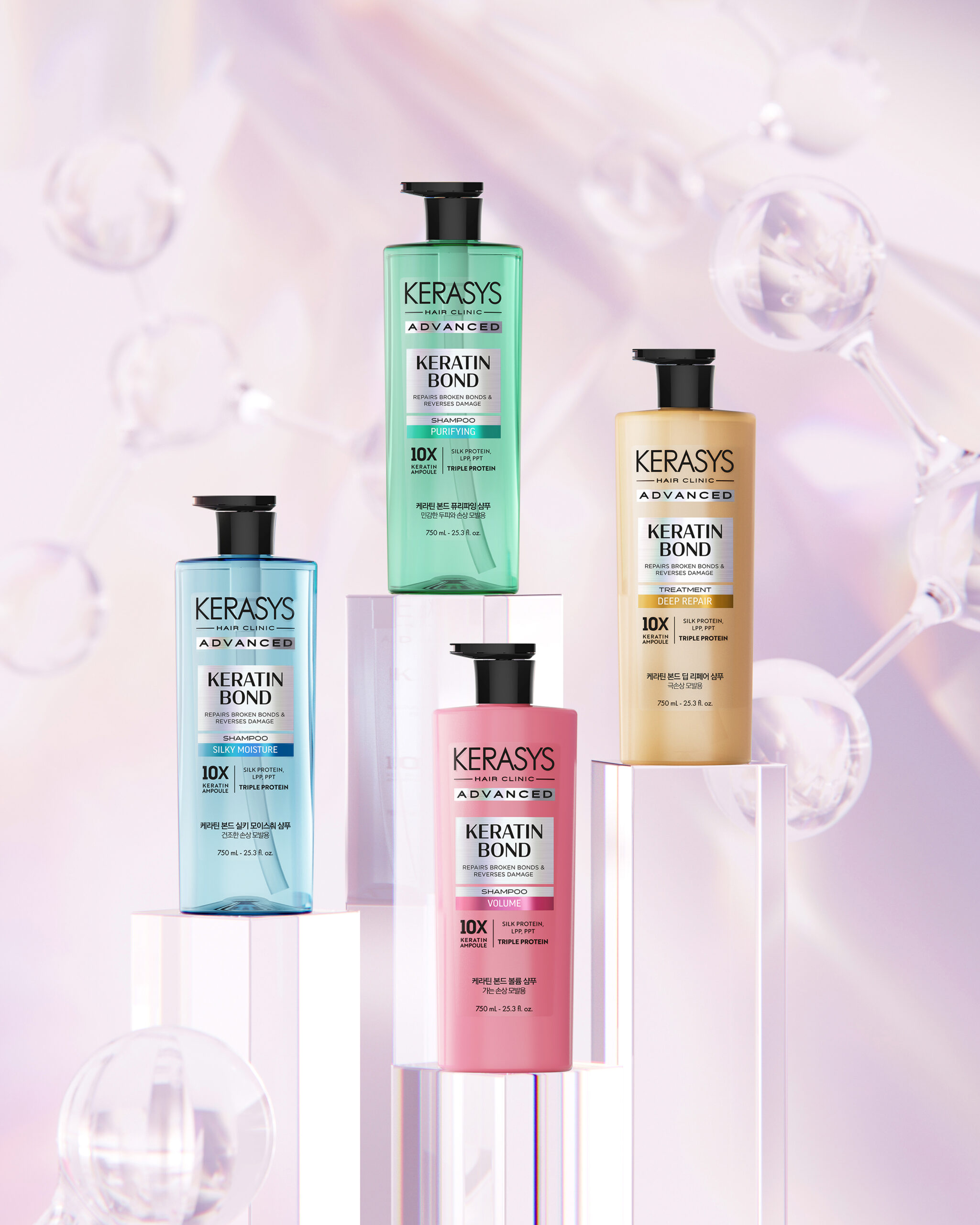
2019년에 출시된 기능성 헤어케어 라인인 케라시스 어드밴스드 라인은, 고농축 앰플 성분으로 모발 고민별로 집중 영양 케어를 제공하는 제품으로 오랜시간 사랑을 받아온 제품입니다. 케라틴본드 시스템과 인텐시브한 성분으로 업그레이드 되면서 제품을 확장하여 어드밴스드 케라틴본드 라인으로 새롭게 출시되었습니다.
프리미엄 헤어케어 이미지를 강화하면서 기능성 헤어 케어 제품의 전문성을과 신뢰감을 시각적으로 전달하는 것을 목표로 소비자가 제품별 기능을 직관적으로 구분할 수 있도록 디자인을 전개하였습니다.
Following the upgrade of the Keratin Bond System, the KERASYS Advanced line was redesigned to better express its premium positioning and advanced hair care technology. The packaging features a clear information hierarchy, intuitive color coding, and a refined visual system that enhances product recognition while communicating a clean, professional, and trustworthy brand identity.
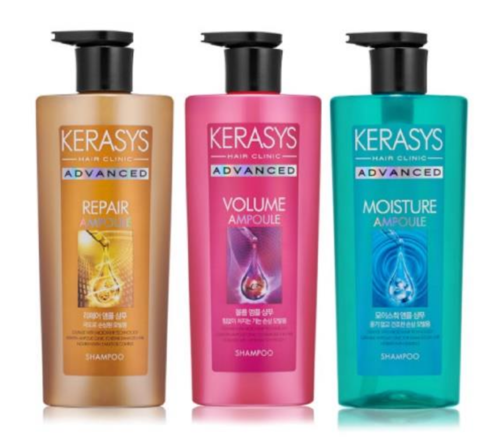
기존 제품은 고농축 앰플 성분을 함유한 기능적 특징을 강조하기 위해 스포이드 앰플 이미지를 전면에 배치하여 제품의 효능을 직접적으로 전달하는 방식으로 디자인되었습니다. 이미지 중심의 그래픽과 높은 채도의 컬러 사용은 시장 트렌드의 변화에 따라 무겁고 복잡한 인상을 주며, 현재의 프리미엄 헤어 케어 시장이 지향하는 세련되고 전문적인 브랜드 이미지와는 다소 거리가 있었습니다.
따라서 리뉴얼 디자인은 프리미엄 이미지를 구축하면서 브랜드의 연속성과 제품의 Newness를 함께 강화하는데 중점을 두었습니다. 정보의 하이라키를 재설계한 타이포그래피를 적용해 제품의 기능성과 전문성을 명확하게 전달하면서 용기 형태와 라인별 컬러 아이덴티티는 계승하되, 채도와 명도를 조정하여 보다 정제된 컬러 시스템을 구축하였습니다.
The original packaging communicated functional benefits through a prominent dropper ampoule visual and a high-saturation color system. While effective at launch, this approach resulted in a visually heavy system that no longer aligns with the more refined, editorial direction of the premium hair care category.
The redesign repositions the brand within a more contemporary, salon-inspired framework, balancing heritage with renewed relevance. A refined typographic hierarchy improves informational clarity and reinforces product credibility, while the existing bottle form and color identity were retained and strategically recalibrated in saturation and tone to achieve a more cohesive and elevated system expression.
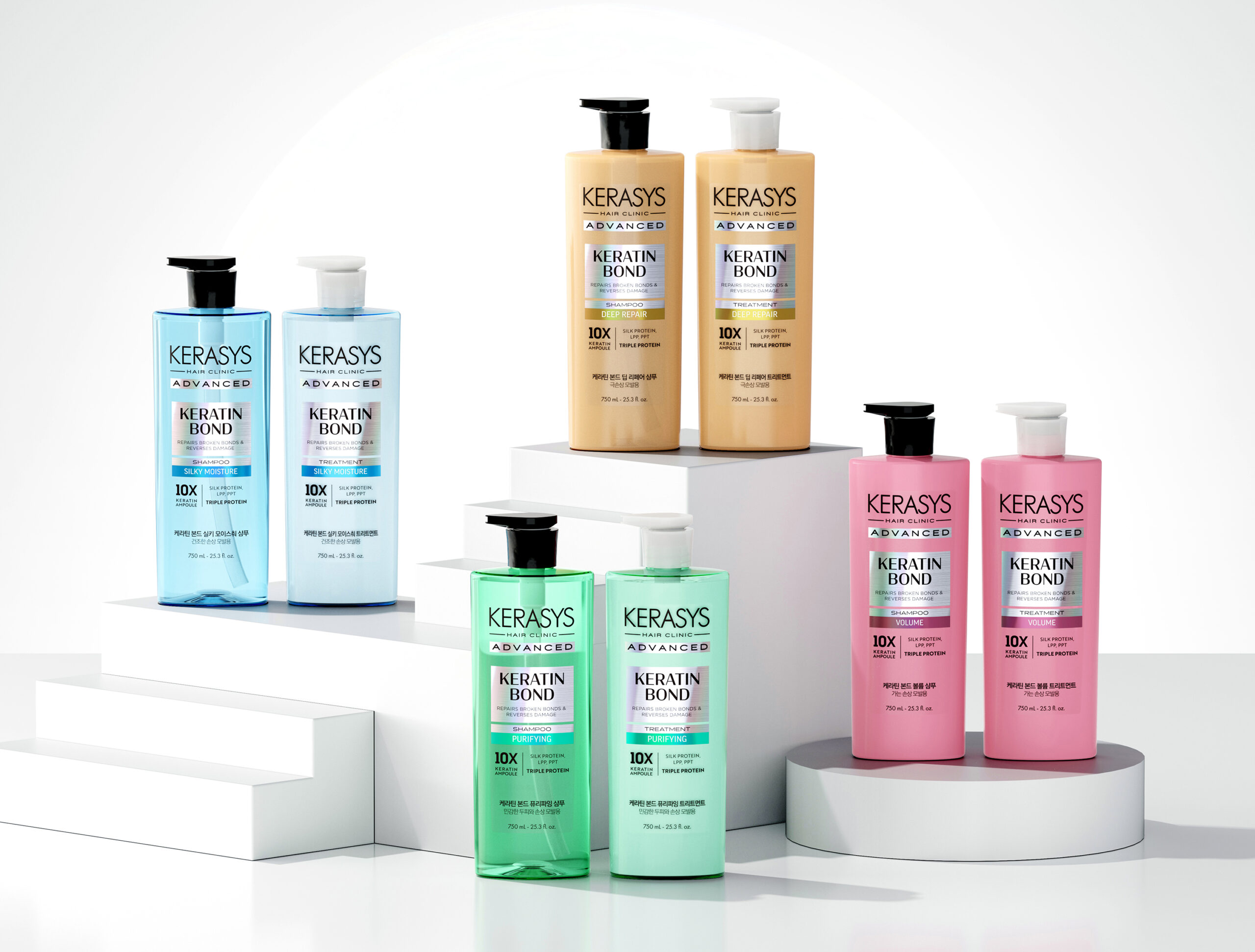


그래픽 디자인은 심플한 레이아웃과 명확한 정보 구조를 기반으로 그래픽 하이라키를 구성하여 소비자가 제품의 기능과 효능을 직관적으로 인지할 수 있는 정보 구조를 구축하였습니다. 로고, 제품명, 핵심 효능을 명확한 타이포그래피 시스템으로 구성하고, 정보의 우선순위를 재설계하여 매대 환경에서도 높은 가독성과 식별성을 확보했습니다. 홀로그램 라벨의 헤어라인 후가공은 동적인 이미지를 주어 제품의 기능적인 특성을 한층 더 느낄 수 있게 도와주며, 살롱 프로페셔널 브랜드에서 느껴지는 클리니컬하고 고급스러운 무드를 구현하였습니다.
The graphic system is built on a minimal layout and clear information hierarchy, enabling consumers to quickly recognize the product’s functional benefits. Logo, product name, and key claims are structured through a disciplined typographic system, with optimized information priorities to ensure strong legibility and shelf impact.
A holographic label with a hairline finish adds subtle movement and depth, enhancing the perception of performance while reinforcing a clean, clinical, and premium salon-inspired aesthetic.

Deep Repair는 따뜻한 골드 컬러로 손상 케어와 영양감을, Volume은 핑크 컬러로 탄력과 볼륨감을, Silky Moisture는 블루 컬러로 수분감과 부드러움을, Purifying은 그린 컬러로 두피 정화와 상쾌함을 표현하여 소비자가 제품의 특성을 직관적으로 이해할 수 있도록 했습니다.
Deep Repair is expressed through a warm gold tone, conveying damage repair and nourishment, while Volume uses pink to represent elasticity and volumizing effects. Silky Moisture is defined by a blue tone that communicates hydration and softness, and Purifying is represented by green to suggest scalp purification and a refreshing finish. This color system enables consumers to intuitively understand each product’s functional benefits at a glance.
Project Manager : Hyunjin Koo
CMF, Package Design : Hyeryeong Yang