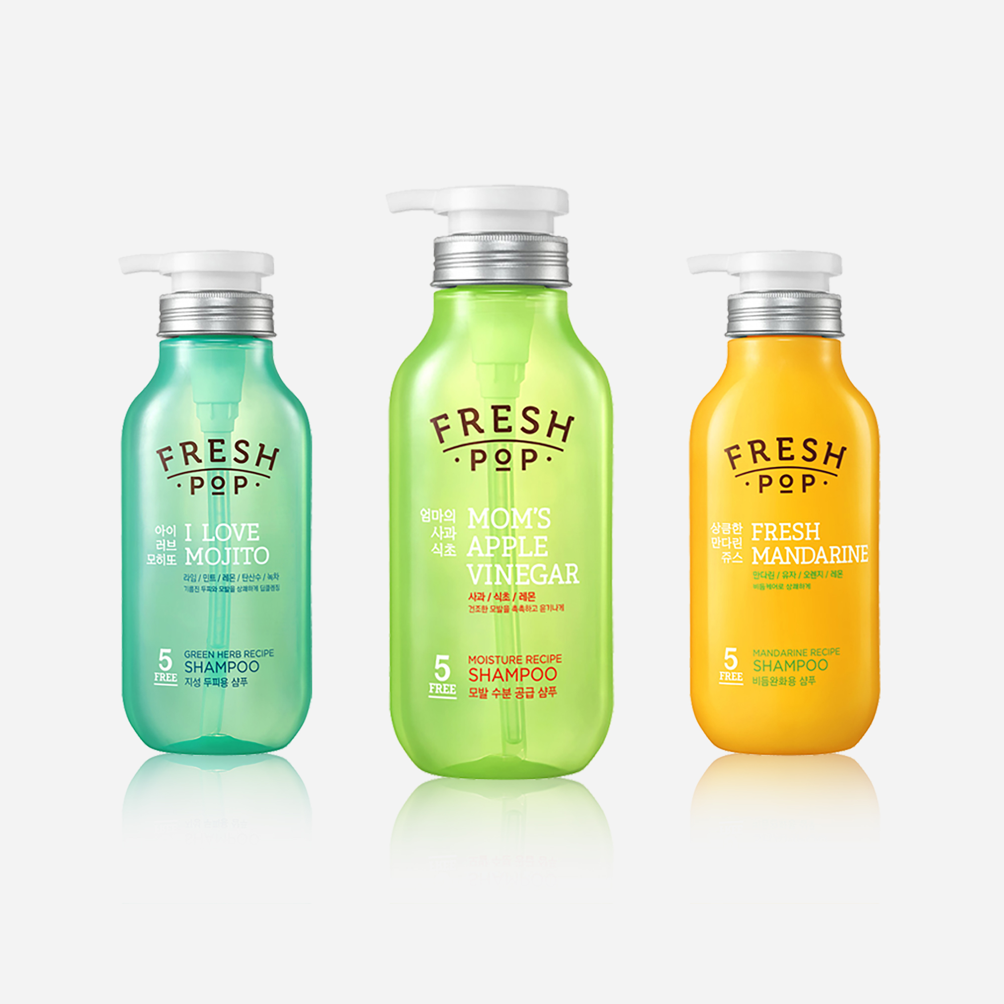
FRESHPOP
MOISTURE RECIPE HAIR
Amorepacific 2015
Product Shape Design
아모레퍼시픽 내부 TF 프로젝트의 일환으로 신규 브랜드 ‘프레시팝(FRESH POP)’의 용기 디자인을 개발하였습니다. 자연 유래 원료에 대한 소비자 니즈 증가하는 시장 트렌드를 반영하여 신선한 슈퍼푸드 레시피를 콘셉트로 한 내추럴 헤어케어 브랜드 프레시팝이 개발되었습니다. 브랜드의 시각적 아이덴티티를 보다 명확하게 구축하는 데 중점을 두고 쉐입 디자인을 진행하였으며, 브랜드 컨셉이 분명하게 드러나는 용기 디자인을 통해 한눈에 인지 가능한 브랜드 아이덴티티 형성에 기여하였습니다.
As part of an internal TF project at Amorepacific, the packaging design for the new brand FRESH POP was developed. Reflecting the growing consumer demand for natural ingredients, FRESH POP was created as a natural hair care brand inspired by fresh superfood recipes. The form design focused on establishing a clear and cohesive visual identity for the brand. By developing a packaging design that distinctly expresses the brand concept, it contributed to building a highly recognizable and instantly understandable brand identity.
브랜드 브랜드 기획의 방향성을 명확히 하기 위해 다양한 이미지 리서치를 장기간 진행하였으며, 이를 바탕으로 브랜드의 연상 이미지를 구체적으로 설정하였습니다. 생기 있고 활력 있는 이미지를 중심으로 밝고 즐겁고 건강한 브랜드 경험을 전달하고자 하였습니다.
Extensive visual research was conducted to define a clear brand direction and establish strong brand associations. By focusing on a vibrant and energetic visual language, the brand aims to communicate a bright, joyful, and healthy experience.
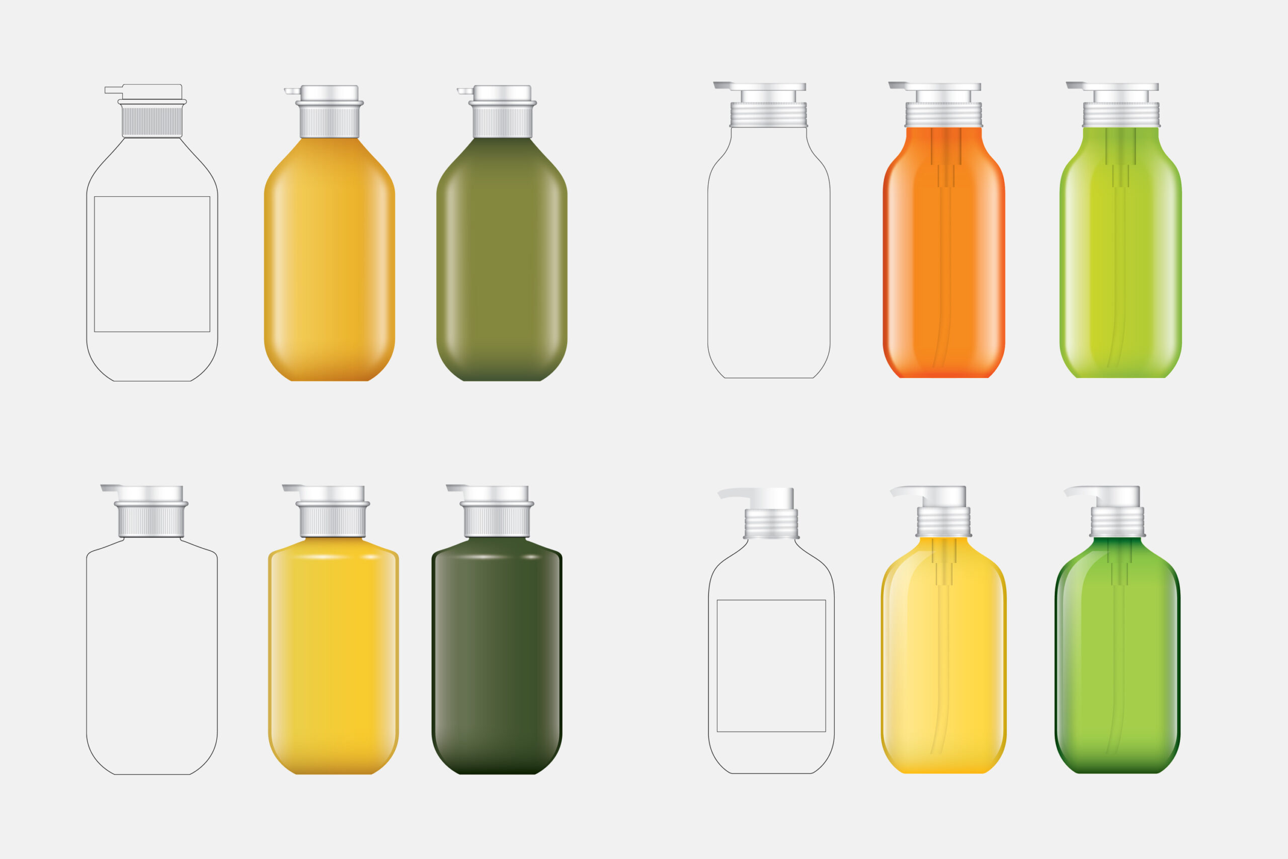
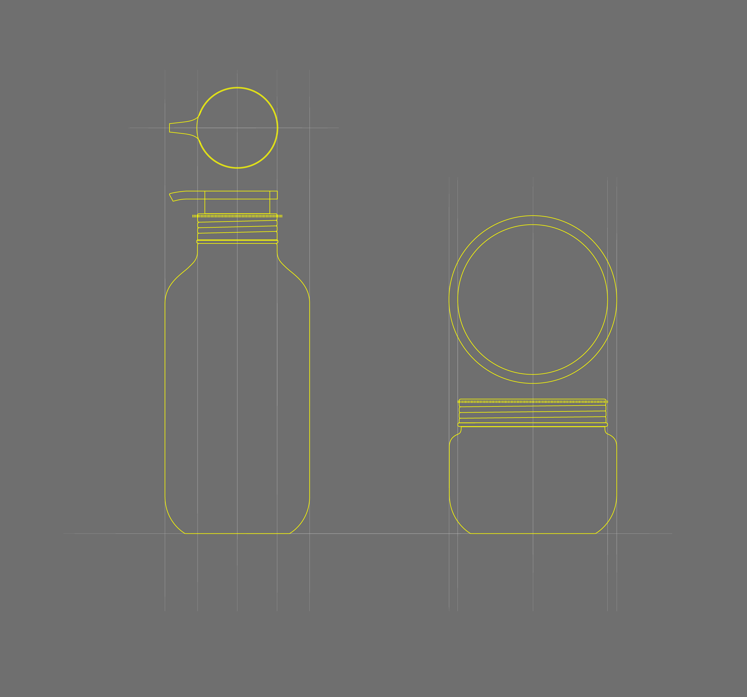
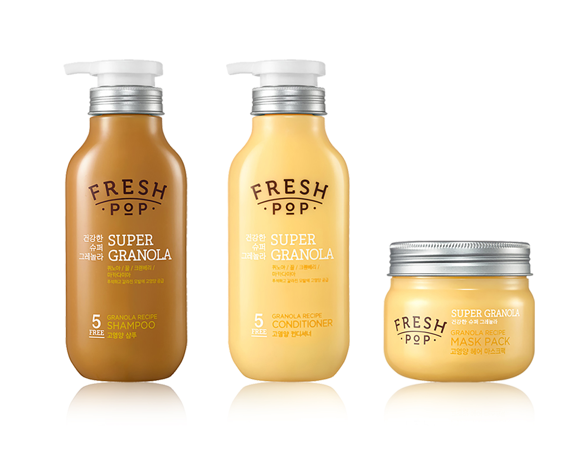
오발 타입의 전면 실루엣을 기반으로, 주스병의 구조적 요소를 재해석한 펌프 숄더와 넓은 캡 비율을 적용하여 용기만 보더라도 브랜드의 스토리가 직관적으로 전달될 수 있도록 일관된 오브젝트 언어로 브랜드 정체성을 구축하였습니다. 당시 시장에서는 시도되지 않았던 주스병의 형태적 컨셉을 헤어케어 제품에 적용하였으며, 해당 디자인 제안 후 곧바로 최종 디자인으로 확정되었습니다.
Based on an oval front-facing silhouette, the design reinterprets juice bottle elements through a sculpted pump shoulder and wide cap proportion. This creates a coherent object language that clearly communicates the brand story through form alone.Introducing a juice-bottle concept—previously unexplored in the hair care category—the design was quickly approved as the final direction.
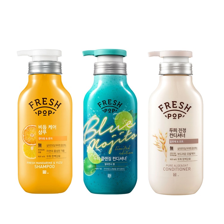
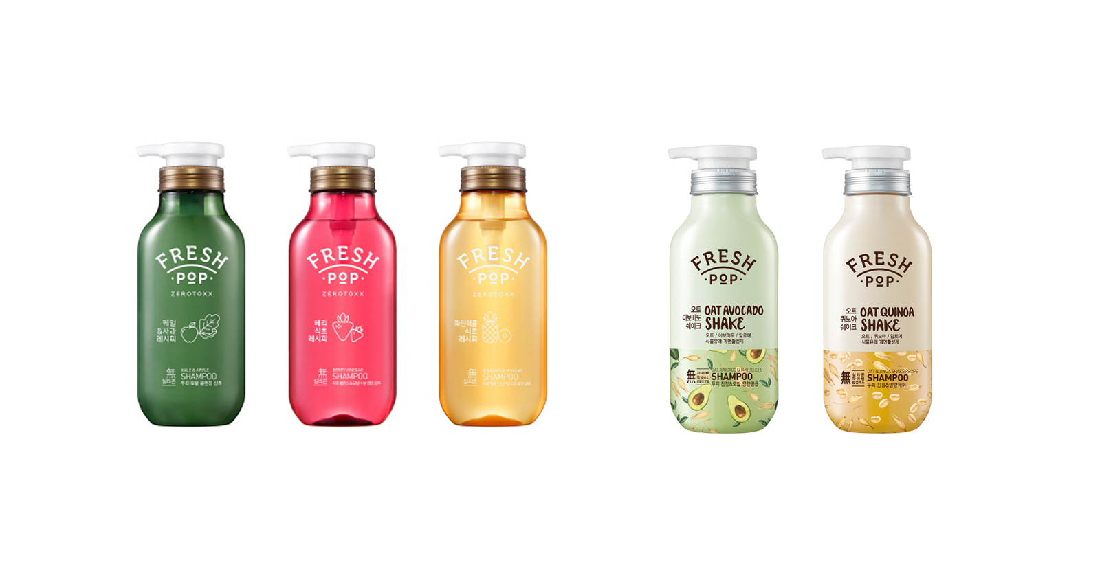
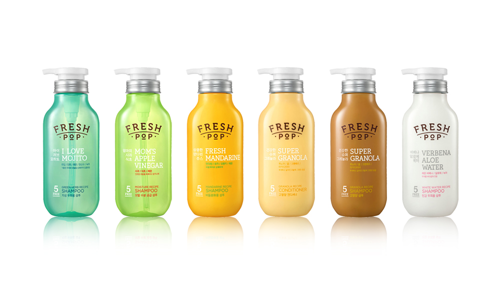
이후 해당 브랜드에서는 다양한 제품군이 출시되었으며, 여러 디자인 베리에이션이 적용되었습니다. 디자인이 확장되고 변화되는 과정 속에서도 브랜드의 핵심 이미지로 일관되는 디자인 시스템의 기반으로 기능하였습니다.
Following the initial launch, the brand expanded into a wide range of product lines with multiple design variations. Throughout this process of expansion and change, the design functioned as a core system, ensuring a consistent expression of the brand’s visual identity.
Project lead : Kyungmi Park / Amorepacific
Product Shape Design : Hyeryeong Yang
Logo, Package Design : 푸른이미지, Amorepacific Mass Design Team
*모든 사진의 크래딧은 아모레퍼시픽에 있습니다.