DR.G
PEELING GEL RENEW
2014
Graphic Design & Production
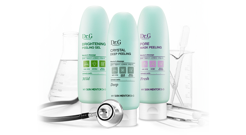
닥터지의 스테디셀러 필링젤 리뉴얼 프로젝트. 닥터의 피부 진단 차트를 모티브로 한 그래픽 레이아웃과 아이콘 시스템을 적용하여 브랜드의 더마 전문성과 신뢰감을 직관적인 비주얼 언어로 구현했습니다.
Renewal project for Dr.G’s bestselling Peeling Gel. Inspired by a dermatologist’s skin analysis chart, the design incorporates a graphic layout and icon system that visually communicate the brand’s dermatological expertise and credibility through an intuitive visual language.

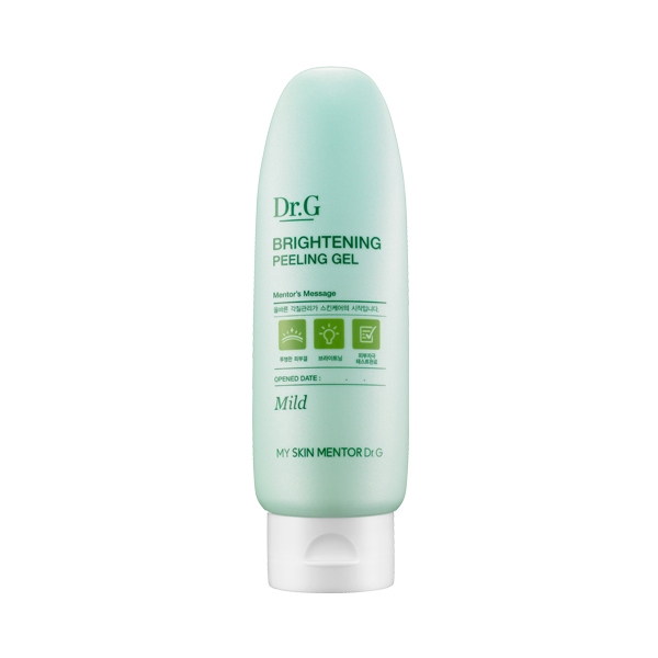
기존 디자인은 제품의 아이덴티티가 충분히 드러나지 않고 시각적 완성도가 다소 부족했습니다. 이를 개선하기 위해 브랜드 로고의 비중을 확대하고 그래픽 요소를 체계적으로 정리했습니다. 또한 피부 진단 차트를 모티브로 한 그래픽 레이아웃과 아이콘 시스템을 적용하여, 닥터지의 더마 전문성과 신뢰감을 직관적인 비주얼 언어로 구현했습니다.
The previous design lacked a strong product identity. The brand logo was emphasized and the graphic system refined, while a skin analysis chart–inspired layout and icon system were introduced to express Dr.G’s dermatological expertise and credibility through an intuitive visual language.

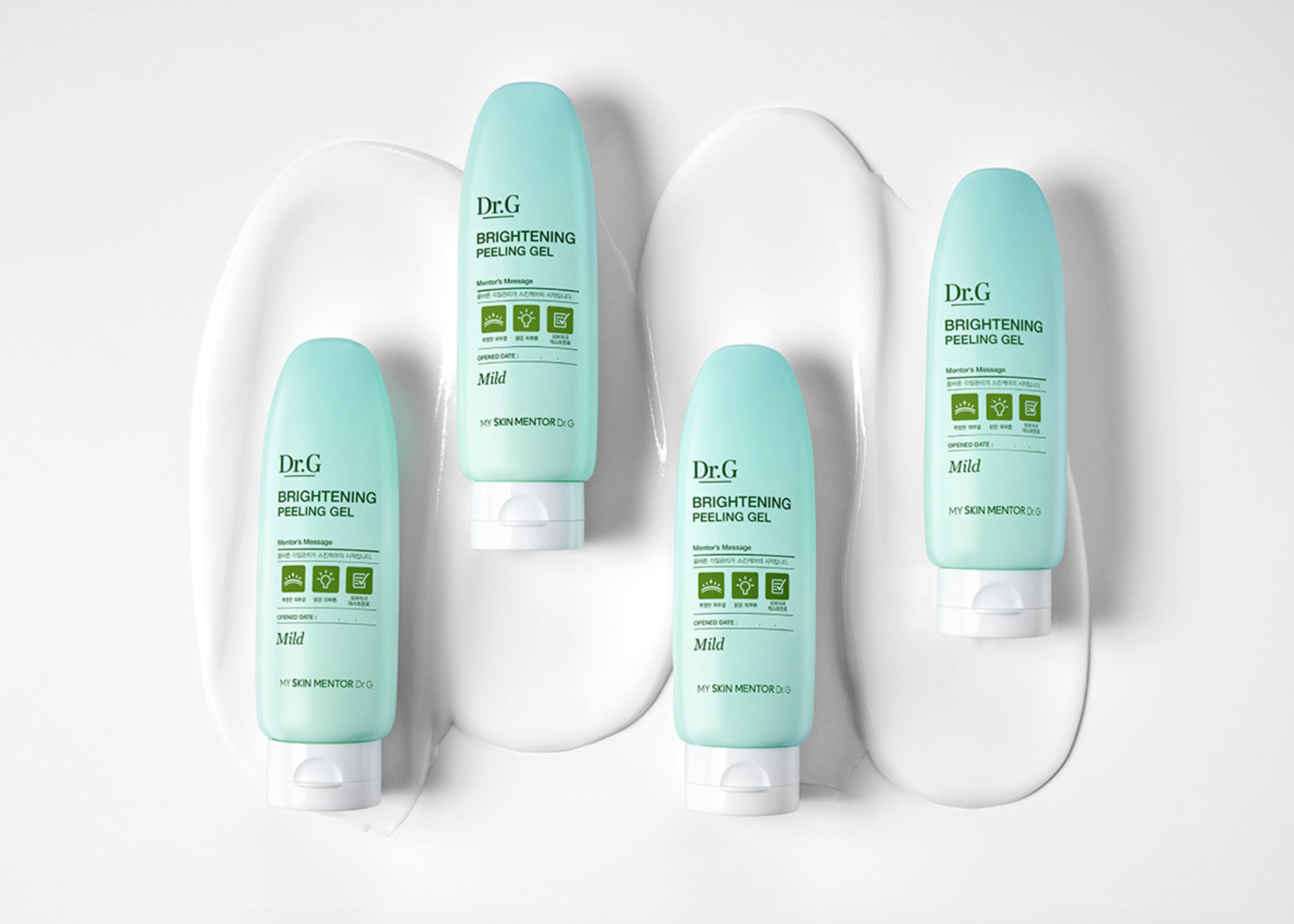
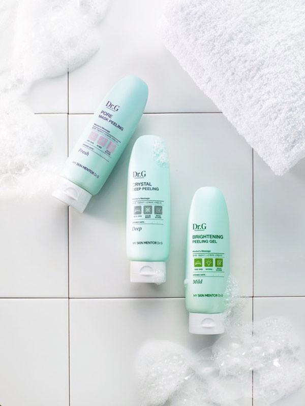
브랜드의 일관성과 제품의 연속성을 유지하는 동시에, 제품별 식별성을 강화할 수 있는 컬러 전략을 적용했습니다. 기존 용기 컬러는 유지하고 아이콘 인쇄 컬러를 차별화하여 3종의 라인업을 명확하고 직관적으로 구분했습니다.
A color strategy was implemented to preserve brand consistency and product continuity while enhancing product differentiation. The original container color was retained, while distinct icon print colors were applied to clearly identify each of the three variants.
DR.G / OUTIN FUTURES
Graphic Design & Production : Hyeryeong Yang