A SOLUTION
Brand Identity
Aekyung 2024
Brand & Design Strategy
Design Planning
Brand Identity
‘a solution’은 1998년 론칭한 국내 최초의 트러블성 피부 전문 화장품 브랜드입니다. 변화하는 유통 환경 속에서 약화된 브랜드 아이덴티티를 재정립하고, ‘Daily Derma Solution Brand’를 새로운 방향성으로 제시하는 리브랜딩 프로젝트를 진행했습니다.
‘a solution’ is Korea’s first skincare brand for blemish-prone skin, established in 1998. This rebranding project redefined its identity and repositioned the brand as a Daily Derma Solution Brand.
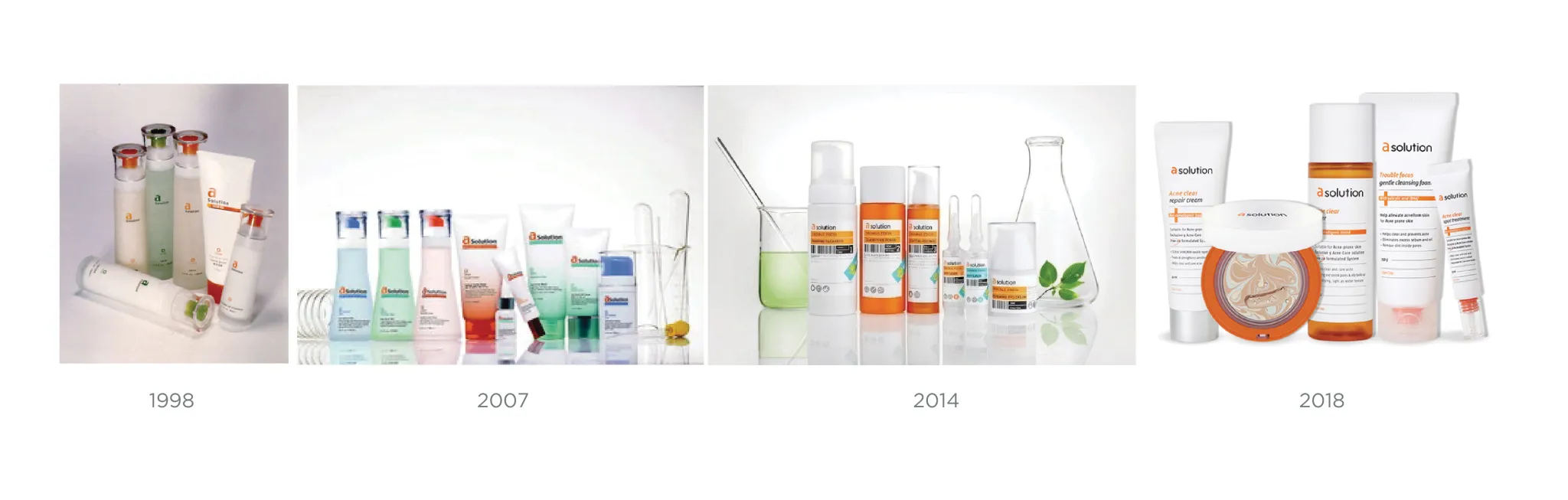
기존 ‘ACNE SOLUTION’에서 출발한 브랜드 의미를 확장하여, 트러블 케어를 넘어 일상적인 더마 스킨케어까지 아우르는 토탈 코스메틱 브랜드로 재정의했습니다. 브랜드명 ‘A’에는 알파벳의 시작을 상징하는 의미와 함께 Active, Advanced, Alive의 가치를 담아 새로운 브랜드 아이덴티티를 구축했습니다.
Originally derived from “ACNE SOLUTION,” the brand was redefined as a total cosmetics brand that extends beyond blemish care to everyday derma skincare. The “A” symbolizes both the beginning of the alphabet and the brand’s core values—Active, Advanced, and Alive.

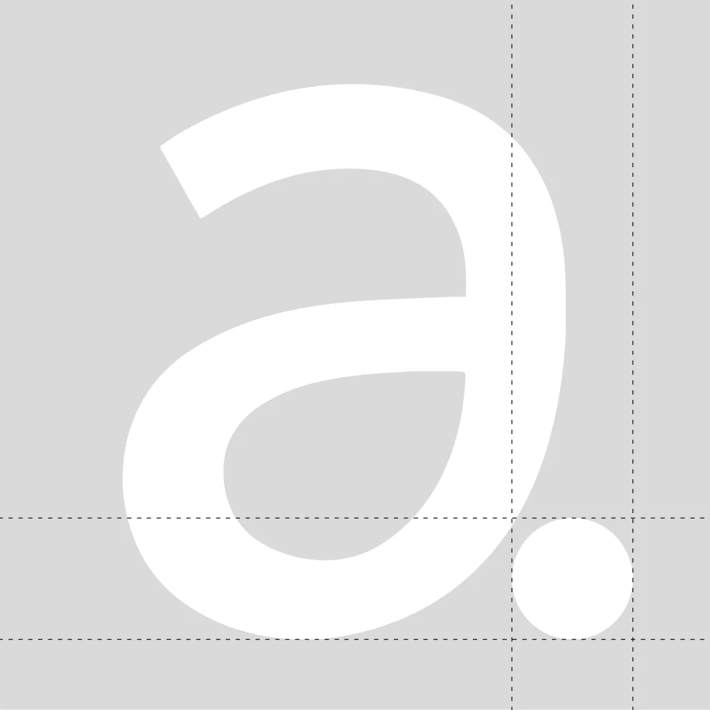
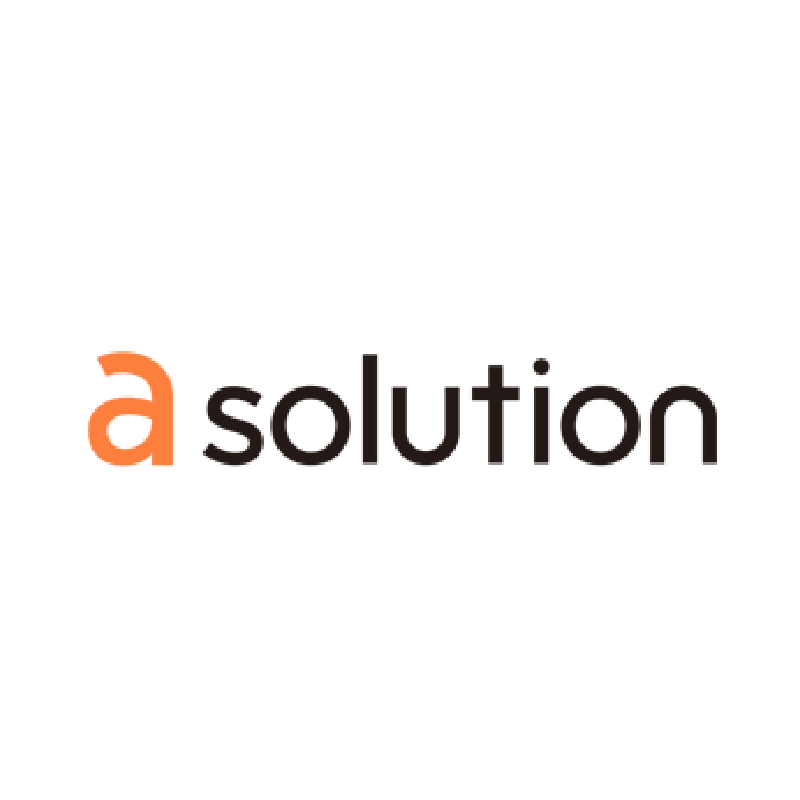
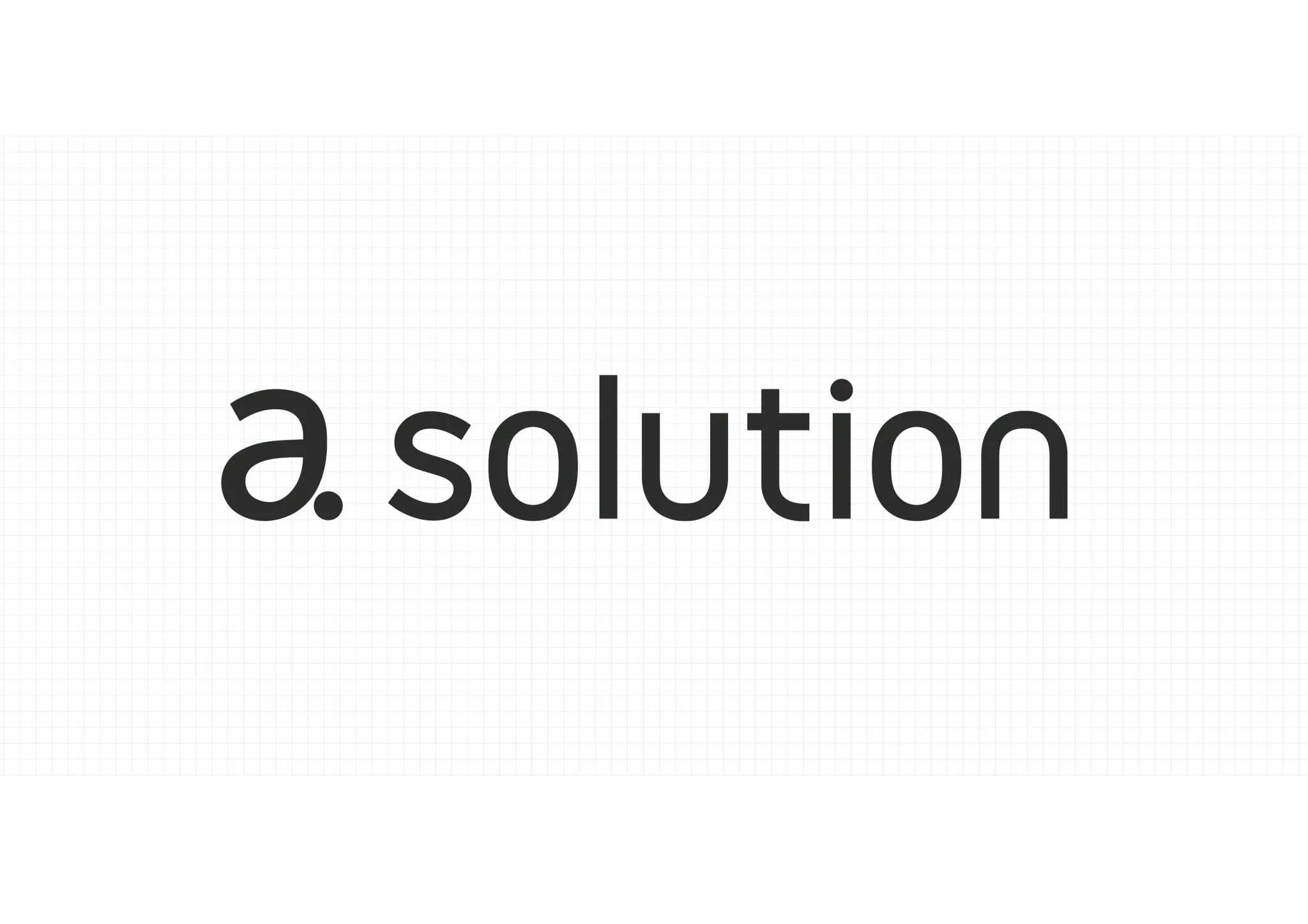
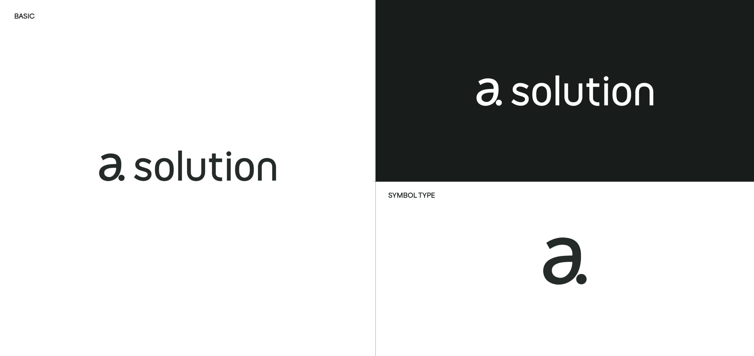
기존 로고는 컬러로 ‘a’와 ‘solution’을 구분했지만, 인쇄 및 다양한 매체 적용에 제약이 있었습니다. 이를 해결하기 위해 단일 컬러 로고를 개발하고, ‘a solution’의 명확한 인지와 발음을 위해 ‘a.’ 형태를 새롭게 제안했습니다. Dot(.)은 피부 솔루션의 새로운 기준을 제시하는 브랜드의 철학을 담고 있습니다. 온라인과 오프라인 등 다양한 접점에서 일관되게 활용할 수 있도록 로고의 활용성을 높였으며, 브랜드를 대표하는 심볼로도 사용할 수 있도록 확장성을 고려해 디자인했습니다.
The previous logo differentiated “a” and “solution” through color, which limited its application across print production and various media. To improve versatility, a solid-color logo was developed, and the “a.” mark was introduced to enhance recognition and ensure the intended pronunciation of “a solution.” The dot (.) symbolizes the brand’s philosophy of setting a new standard for skincare solutions. Designed for consistent use across both digital and physical touchpoints, the logo was also developed to function as a distinctive standalone brand symbol.
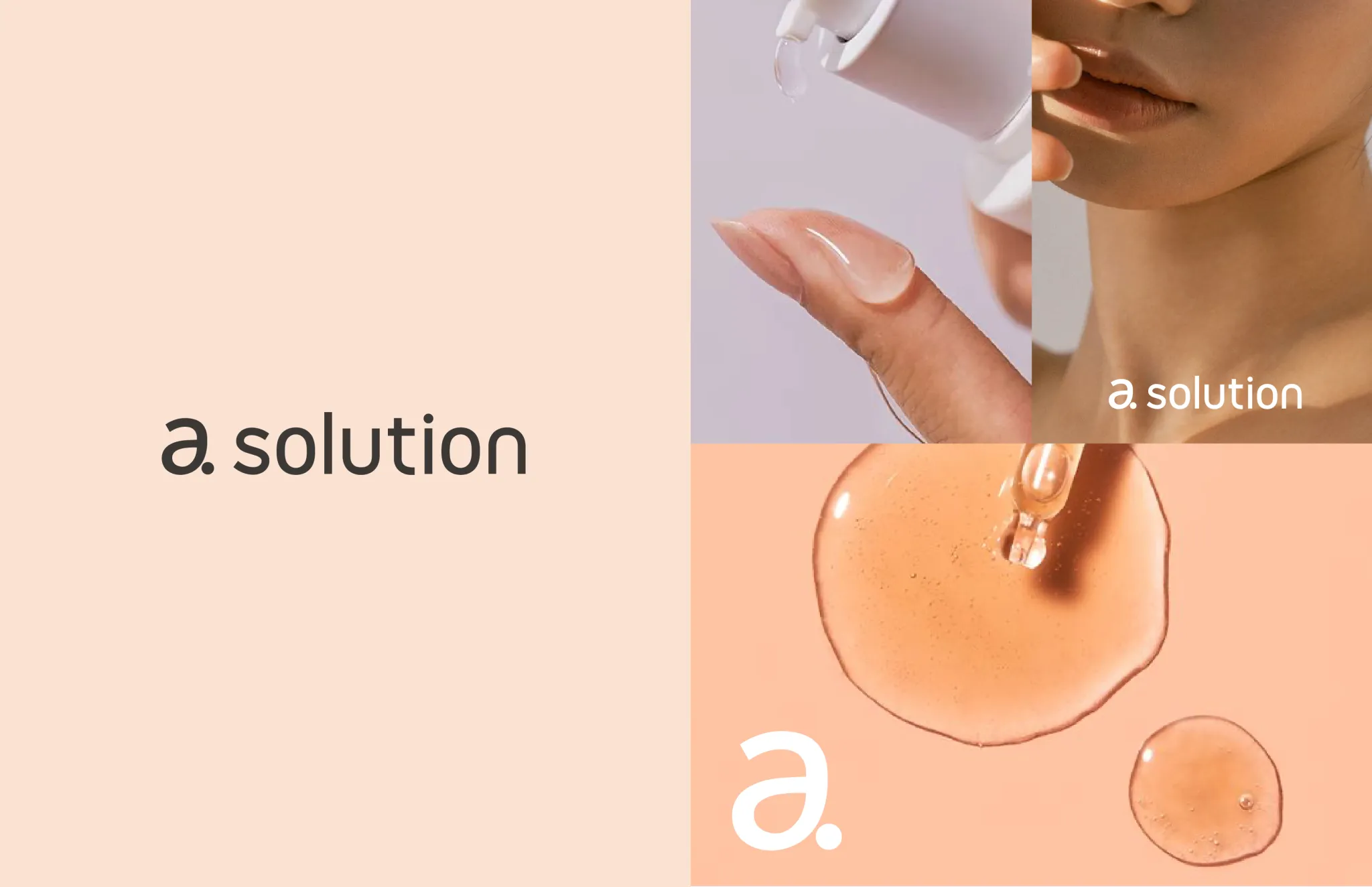
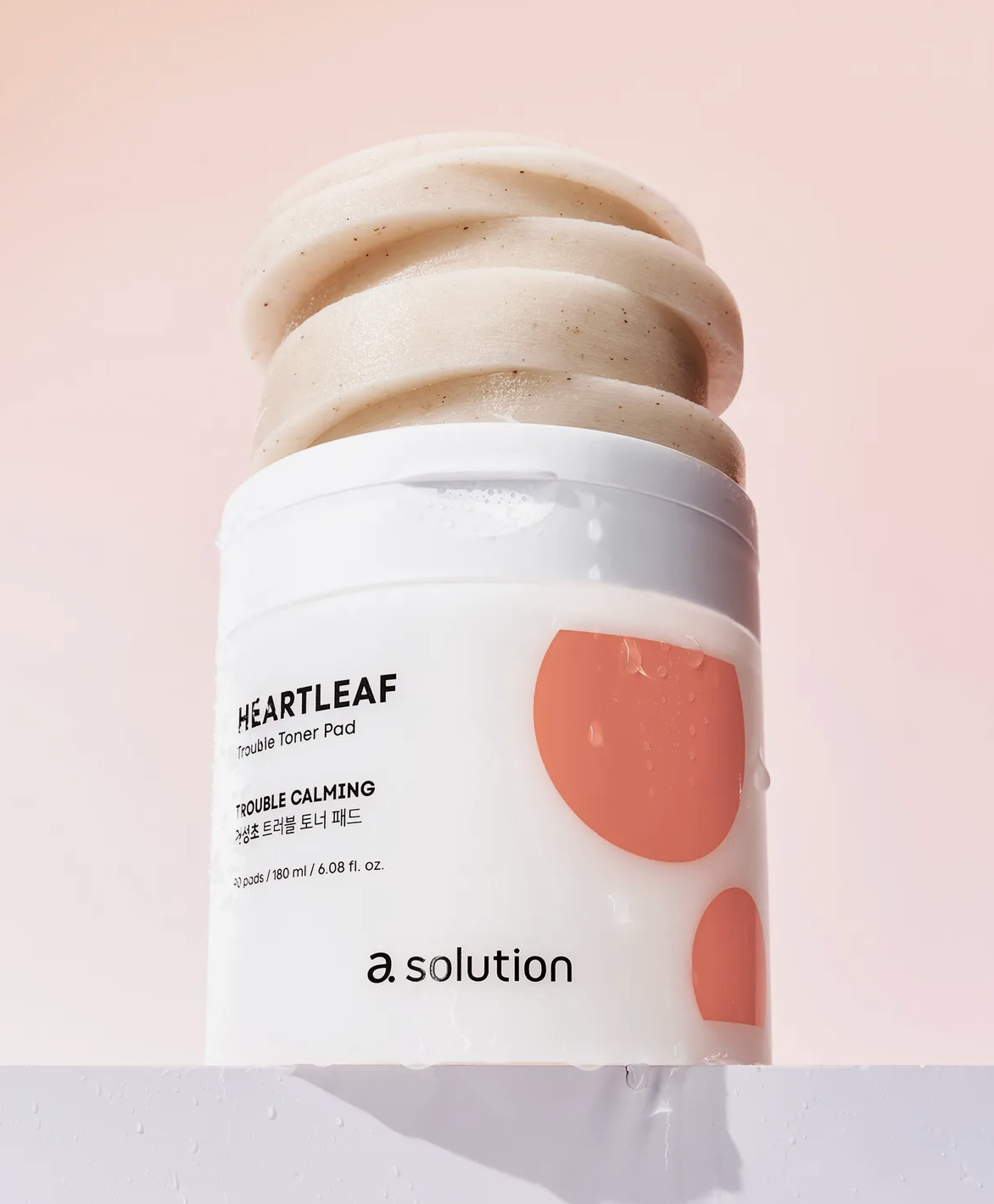
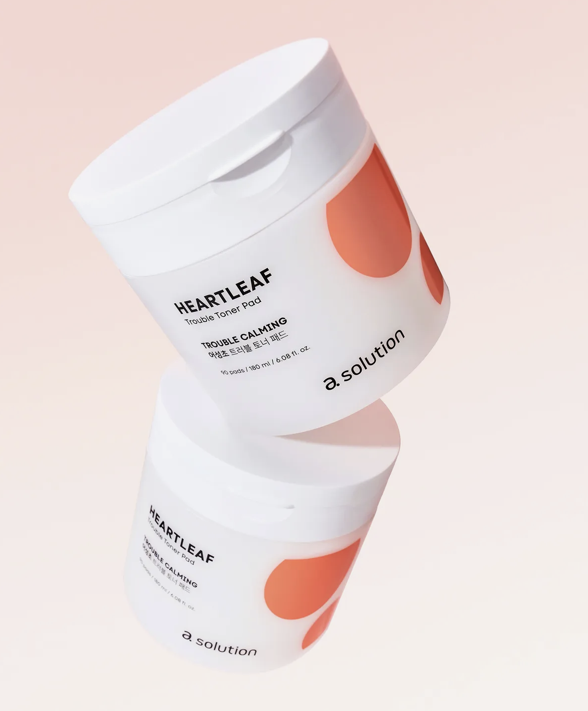
심플한 솔리드 컬러 로고를 기반으로 패키지와 브랜드 비주얼은 트렌디한 방향으로 재정립했습니다. 젊고 감각적인 컬러 시스템을 적용해 브랜드의 현대적인 이미지를 강화하고 소비자 매력도를 높였습니다.
Building on the simple solid-color logo, the packaging and brand visuals were refreshed with a contemporary aesthetic. A youthful and vibrant color system strengthened the brand’s modern identity while increasing its visual appeal.
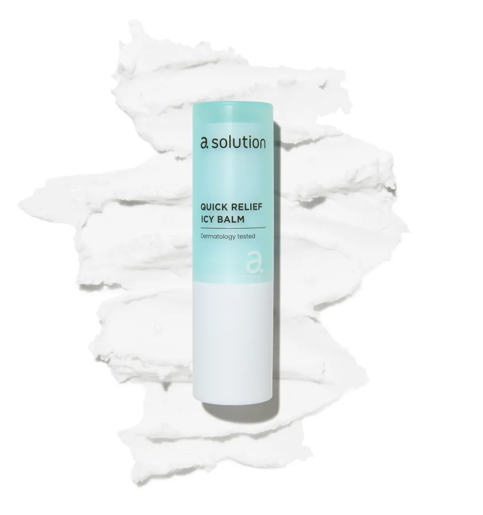


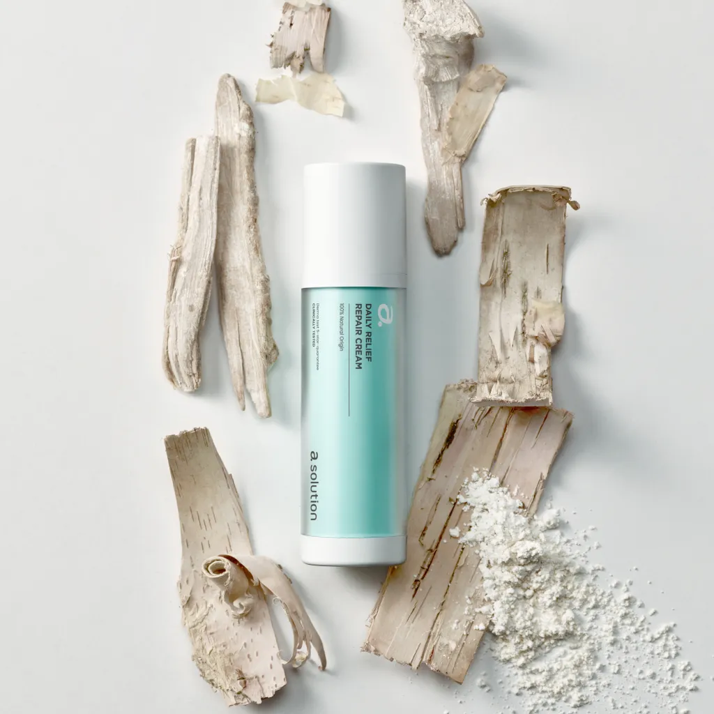
리브랜딩과 함께 출시된 릴리프 라인은 민감한 피부를 위한 저자극 데일리 스킨케어 라인입니다. 저자극 성분을 직관적인 타이포그래피와 컬러로 표현해 브랜드의 신뢰성을 강화했으며, 용기의 투명도와 소재까지 세심하게 설계해 제품의 완성도를 높였습니다.
Introduced as part of the rebranding, the ‘Relief Line’ is a daily skincare range for sensitive skin. Clean typography and a natural color palette highlight its gentle formulation, while meticulous attention to the container’s transparency, material, and finish elevates the product’s overall design quality.
Project Designer : Hyeryeong Yang, Sohee Kim
Identity Design : 푸른이미지
Package Design : heesung Jo